Modern websites rely heavily on visual design to capture attention and improve user engagement. However, creating custom shapes in CSS can feel complicated, especially when dealing with coordinates and polygon values manually. Many designers struggle with writing accurate clip-path values, which can lead to trial-and-error adjustments and wasted development time.
This is where Clippy becomes useful. Clippy is a free, browser-based tool that makes creating custom CSS shapes with the clip-path property simple and visual. Instead of calculating percentages and guessing coordinates, users can drag points directly on a live preview and instantly copy the generated CSS code for use in their projects.
The challenge with custom CSS shapes is precision. Even small mistakes in polygon coordinates can distort the layout or create unexpected shapes. For developers who are new to CSS clipping or working on tight deadlines, manually defining shapes can slow down the workflow and reduce productivity. Visual tools like Clippy reduce that friction by providing instant feedback and accurate code generation.
The clip-path property allows developers to clip an element into specific shapes such as circles, ellipses, polygons, or inset rectangles. It can also reference SVG sources for more advanced designs. This makes it extremely powerful for modern UI design, creative layouts, hero sections, image masks, and interactive components.
One of the main advantages of clip-path is that it works directly in CSS without needing additional images or graphics software. Because it is a CSS property, shapes remain lightweight, scalable, and responsive across devices. This contributes to better performance compared to heavy image-based designs.
Let’s walk through a simple example of creating a custom shape using HTML and CSS.
Step 1: Create html and css
<div class="customshape">

</div>
.customshape {
width: 200px;
height: 200px;
background: var(--secondarycolor);
clip-path: polygon(20% 0%, 80% 0%, 100% 100%, 0% 100%);
}
In the example above, the clip-path property defines a four-point polygon. Each pair of values represents the X and Y coordinates in percentage format. While this works, adjusting those values manually can be confusing if you want more complex shapes.
Step2: Go to website https://bennettfeely.com/clippy/ and select any shape from right side
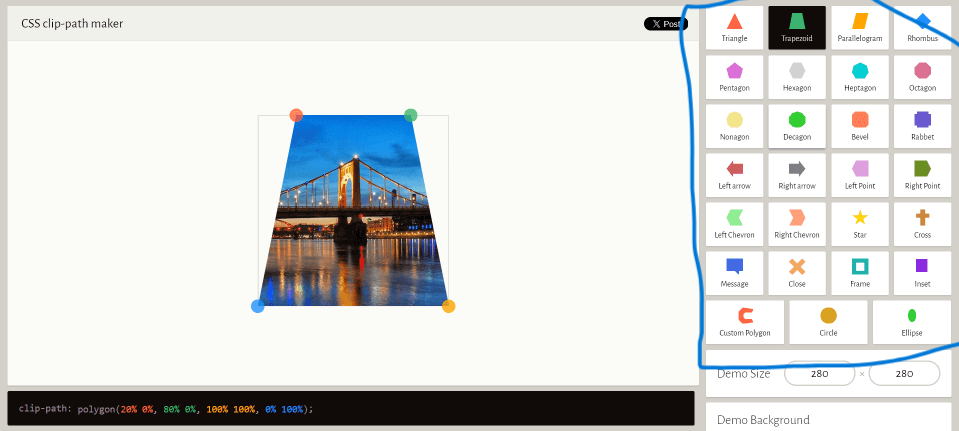
Clippy provides a visual interface where you can select predefined shapes such as triangles, trapezoids, stars, and complex polygons. You can also drag the shape points to customize them according to your design requirements. As you adjust the shape, the CSS code updates instantly at the bottom of the page.
Step3: When you click on any shape its code is showing in bottom copy code and paste in CSS as mentioned above
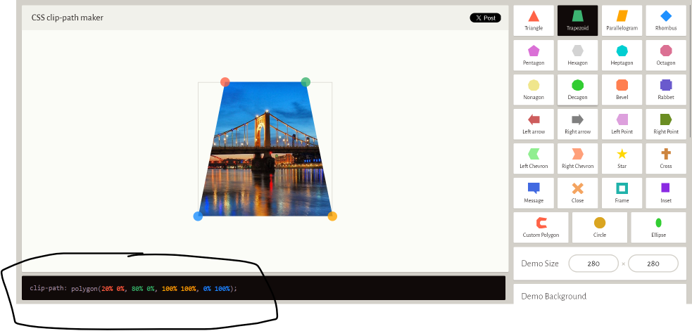
After copying the generated clip-path value, paste it into your CSS file under the desired class. This eliminates guesswork and ensures accurate polygon coordinates. The result is a clean, custom-shaped element that works consistently across modern browsers.
Another important feature of clip-path is that CSS animations and transitions are possible when you use two or more clip-path shapes with the same number of points. This means you can create smooth shape morphing effects between states such as hover or active. For example, a button can transform from a rectangle into a slanted polygon when hovered, improving visual interaction.
When creating animated clip-path effects, ensure both shapes have an equal number of coordinate points. If one polygon has four points and another has five, the transition will not work correctly. Maintaining consistency in the number of points allows the browser to interpolate between them smoothly.
From a performance perspective, clip-path is efficient because it relies on CSS rendering rather than large image files. This can contribute to improved page speed, which is important for search engine optimization and user experience. Faster websites generally reduce bounce rates and encourage longer visitor engagement.
In terms of practical use cases, clip-path shapes are commonly used in hero sections, banners, image masks, call-to-action sections, product highlights, and creative backgrounds. Designers use them to break away from traditional rectangular layouts and create visually engaging sections without extra graphics.
It is also worth noting that clip-path works best in modern browsers. While browser support is strong today, testing across devices ensures consistent rendering. Developers should always verify responsiveness and behavior on different screen sizes.
In conclusion, creating custom CSS shapes does not have to be complicated. While manually writing clip-path values can be challenging, tools like Clippy simplify the process by offering a visual editing experience and instant code generation. By combining clip-path with CSS transitions and animations, developers can create interactive and modern designs without relying on heavy graphics.
Using clip-path effectively can enhance website design, improve creativity, and maintain performance standards. Whether you are a beginner learning CSS or an experienced developer building advanced layouts, mastering clip-path and tools like Clippy can significantly streamline your workflow and expand your design possibilities.